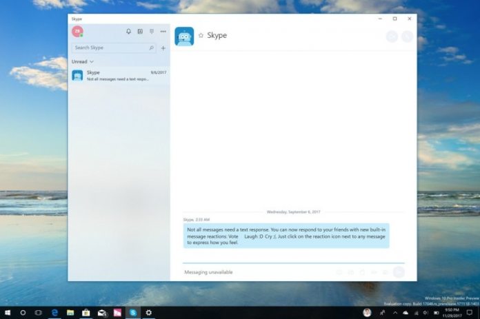
First, though, users may notice a considerable redesign. According to MSPowerUser, Skype for Windows 10 now has the Fluent Design features seen in Insider builds. The new look is now available on release preview rings, with some reports of them on production builds. The message list and top menu bar have received a rework, with reveal highlight also present. In general, it looks better than before, though there’s still a bit of work to be done.
New Features from Skype for Desktop
More practical than the redesign is Skype for Windows 10’s new features, which bridge the gap a little. As mentioned earlier, the app now has a gallery, meaning you can click a button next to a chat and see all the files, links and media shared. Of course, that may not be much help if you miss the image in the first place, so Microsoft is bringing across the notification panel. Present in the desktop app’s redesign, it provides a single place from which to view @mentions, quotes, and more. Most importantly, though, status updates are finally back. Under your profile, you can now set yourself as away, as well as a mood message. It’s a vital function and we’re glad to see it back. Finally, Search is improved, allowing you to look through all chats to find individual phrases. Though the features aren’t anything new for desktop users, this is a significant leap forward for Skype for Windows 10. Unfortunately, there are still a few persistent issues with performance and reliability, but we have no doubt the team will get to those next. You can read the full list of changes on the Skype blog.


